The Complete Guide to In-app Notifications
Drive more value for users without interrupting them — the secret of in-app notifications.
What are in-app notifications?
In-app notifications are messages that appear inside a software product, usually with the goal of driving user actions. The most effective ones are timely, relevant, and clearly written. By the end of this guide, you'll be creating best-in-class in-app notifications.
Before we dive in, here are a few examples of how in-app notifications are used:
Onboarding: welcome messages for new users to highlight key features
Launches: notifications about new app updates or features
Adoption: reminders to complete a task like filling out a profile
Conversion: promotional messages about sales or offers
Feedback: prompts to rate the app or take a survey
Support: alerts about errors like failed uploads
Why use in-app notifications?
In-app notifications are an easy way to start improving your metrics. We consider them one of the cornerstones of user engagement. Here are some of the ways in-app notifications can help achieve growth goals.
Improve user experience
Well-timed and well-designed in-app notifications show users what to do next. They're an opportunity to give helpful tips and onboarding assistance as users navigate your app. In-app notifications also give product teams the ability to highlight new features or content that aligns with a user's interests.
Drive conversions and sales
When users hit paywalls, cross free thresholds, or show upgrade intent, in-app notifications pave the way for one-click activation. For example, at Flywheel we use in-app notifications to prompt users to upgrade after adding too many Milestones. When using a tool like Flywheel, you can also drive more conversions by showing different messages to each persona.
Onboard and educate users
In-app notifications are a useful way to onboard new users by highlighting key features and flows as they first use your app. You can provide tooltips and slideouts to showcase how to use different parts of your app during the critical first sessions.
Communicate important information
Send in-app notifications to inform users of important app updates, new features, maintenance windows, or other time-sensitive information. This allows you to reach users directly even when they don't have push notifications enabled.
Types of in-app notifications
There are many popular types of in-app notifications, and they all serve different purposes. Choosing the right one is half the battle — everything else comes easy.
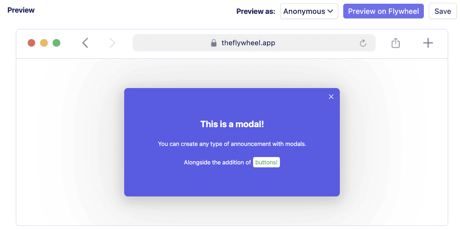
Modals
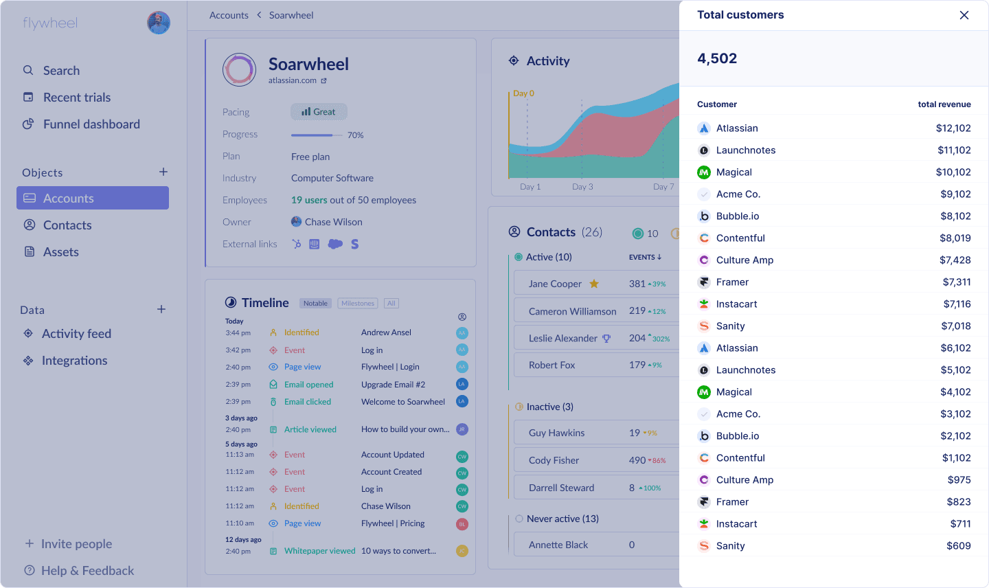
Modals are overlay notifications that take up part or all of the screen. They demand the user's attention and are useful for announcements, prompting users to take key actions like signing up or making a purchase, and communicating urgent information.
Banners
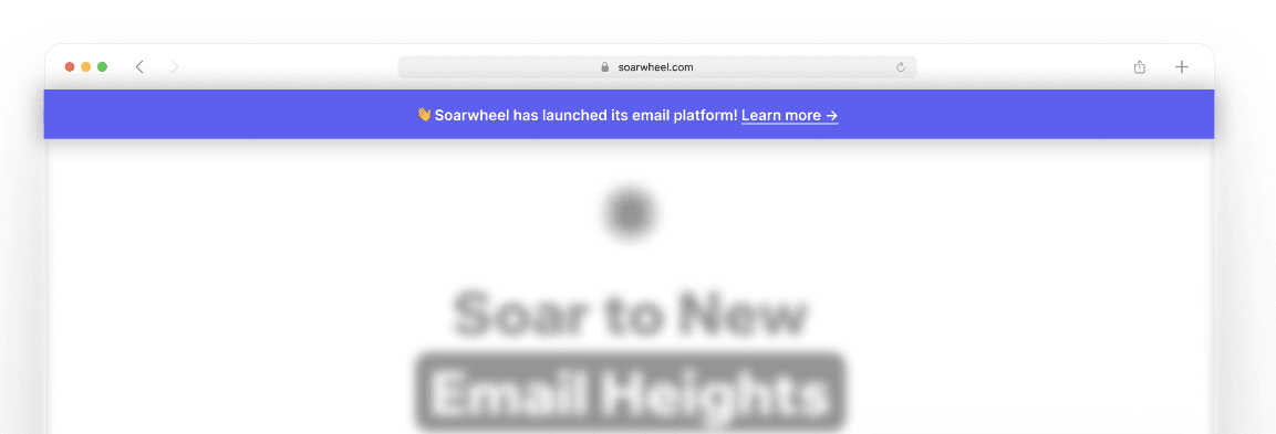
Banners are subtle bars that appear at the top or bottom of the screen and provide a brief message. They work well for unobtrusive notifications about new features or content.
Tooltips
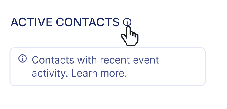
Tooltips are contextual help notifications that explain how a particular page or feature works. They provide guidance without interrupting the user flow and are great for onboarding.
Slideouts
Slideouts slide into view from the edge of the screen when triggered. They can display more content than banners and are commonly used for promotions or announcing new content.
In-app tours
In-app tours walk users through the app's core features and flows step-by-step. They help new users get oriented and understand how to use the app through tooltips paired with highlighted UI elements.
Microsurveys
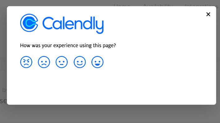
Microsurveys are quick in-context questionnaires that help gather user feedback and insights. They provide a lightweight way to engage users without disrupting their flow.
The key is to choose the notification style that best fits the message and intended user action for each scenario. Well-designed notifications enhance the app experience rather than annoying users with irrelevant content.
When to use each notification type
The type of in-app notification you choose should align with the message you want to convey and the action you want users to take. One of the easiest ways to start using in-app notifications is to start from our engagement template gallery. If you want to begin from scratch, here are some guidelines on when to use each notification format:
Tooltips
Use tooltips for quick tips and guidance to help users learn a new feature or understand how something works. Tooltips are best for educational messages that don't require immediate action.
Modals
Choose modals for prominent, must-see messages that require confirmation from the user. Modals are useful when you need the user's attention for promotions, announcements, or critical information.
Banners
Banners are great for non-critical alerts and updates, such as new content in an activity feed. Banners allow users to glance at the information without disrupting their workflow.
Slideouts
Use slideouts to subtly notify users of new or recommended content and features. Slideouts are less disruptive than modals and work well for suggestions and discovery.
Product tours
Product tours provide guided walkthroughs for new users to understand how to use your app. Use them to onboard users and ensure they know how your product works.
Microsurveys
Leverage microsurveys for quick user feedback at the most contextually relevant moments. For example, ask for product feedback after a user has completed a key workflow.
Choose the notification type based on your goals and the context of the user. With testing and optimization over time, you'll learn which formats work best for different use cases.
In-app notification best practices
Greet new users - Welcome new users to your app with a short tutorial or walkthrough to help them get started. Explain key features and how to navigate the app.
Personalize and segment - Tailor notifications based on user attributes and behavior. Show relevant content to users based on their interests and actions in the app.
Clear call to action - Every notification should have a clear CTA button or link for users to tap. Make it obvious what action you want users to take.
Easy to dismiss - Allow users to easily dismiss a notification if they don't want to engage with it right now. Don't force users to take an action before dismissing.
Don't overdo it - Limit the number of notifications you send and avoid sending too frequently. Spread out notifications and only send the most important, timely ones.
Allow opt-out - Give users the ability to disable certain notification types if they find them annoying or irrelevant. Respect user preferences.
Test and optimize - A/B test different notification content, frequency, timing, and design. Analyze performance data to optimize over time.
Context is key - Send notifications only when contextually relevant based on where the user is in the app and their recent behavior. Avoid poorly timed, irrelevant notifications.
Keep it short - Get to the point quickly in a sentence or two. Long blocks of text are unlikely to be read.
Actionable - Include a relevant action the user can easily take. Don't just broadcast information without a way for them to engage.
Setting up in-app notifications
Adding in-app notifications to your software product can be done in a few simple steps:
Decide which type of notification you want to implement (banner, modal, tooltip, etc). Refer to the types of notifications section above.
Determine what event or user action should trigger the notification to appear. For example, you may want a modal to appear after a user has been inactive in the app for 5 minutes. Or, when a user clicks on an element.
Add the notification code to your app. Most products like Flywheel have simple code snippets to allow displaying in-app messages. You can quickly generate and test notifications.
Customize the look and feel of the notification. Some products allow changing colors, fonts, adding images/icons and buttons to the notifications. Brand the notifications to match your app.
Set up any additional logic needed. For example, you may want to only show a notification to users who have yet to use a specific feature. Or, show different messages to separate user segments.
Analyze performance and optimize. Use tools like Flywheel to view notification clicks, conversions, and other metrics. Experiment with messaging, triggers, and more to improve results.
With a few lines of code, you can start sending customized in-app notifications that engage your users. Check out our flywheel.js documentation to learn more about starting today with Flywheel.
Measuring notification performance
In-app notifications may seem straightforward, but optimizing them requires diligent measurement and testing. Here are some key metrics you should track for your in-app notifications:
Impressions: Number of times the notification is displayed to users. Shows your reach.
Click-through rate: Number of notification clicks divided by impressions. Indicates engagement.
Conversion rate: Number of desired actions (purchases, signups, etc) after seeing the notification divided by impressions. Measures effectiveness.
Dismissal rate: Percentage of notifications dismissed or ignored without any action. Can indicate poor targeting or messaging.
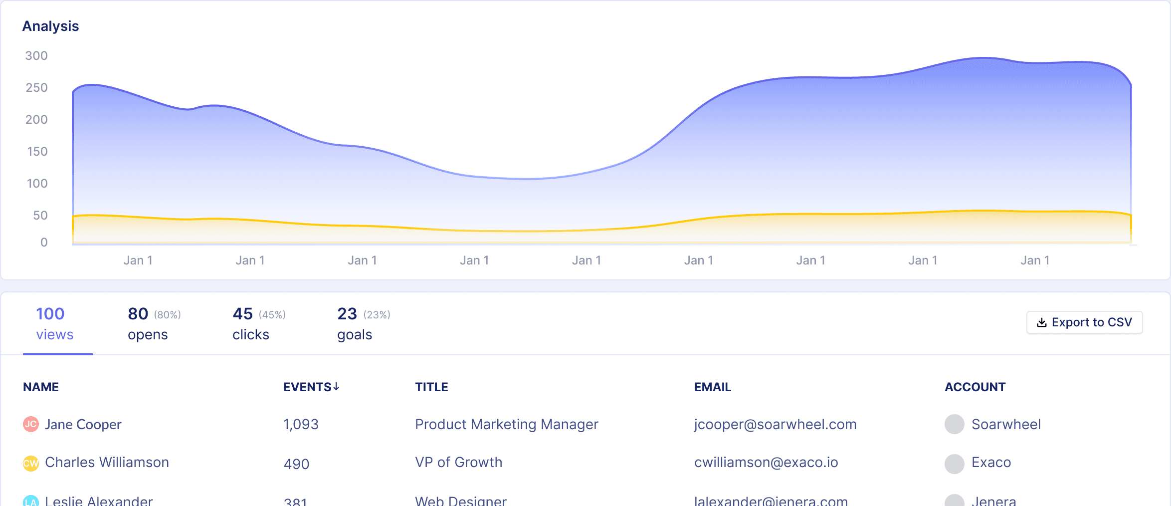
Make sure to segment these metrics by notification type, user attributes, and other factors to gain insights.
A/B testing can also help to optimize your in-app notifications over time. Test variations in your messaging, display style, timing, and more. For example, you could test:
Short title + description vs longer descriptive content
Green CTA button vs Red CTA button
20% discount vs 40% discount coupon code
Trigger after 2 days of inactivity vs 5 days of inactivity
Over time, keep iterating through small A/B tests to continually improve your in-app notification strategy based on data. This will lead to higher engagement, conversions, and user retention over the long run.
Examples and case studies
In-app notifications are widely used by popular apps to engage and retain users. Here are some examples of effective in-app notification strategies:
Spotify
Sends a persistent modal notification to non-paying users periodically suggesting they upgrade to premium. This leverages the user's active engagement in the app to upsell premium.
Welcomes new users with a multi-screen product tour highlighting key features like browsing, playlists, and more. This onboarding experience helps new users get value right away.
Uses slideout notifications to alert users to new friend requests, messages, and notifications to encourage re-engagement.
Tests different variants of new feature announcements to subset of users to gather feedback before launching more widely.
Slack
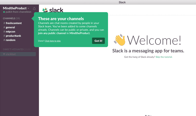
Welcomes new users with an adjustable notification prompting them to take a product tour. Users can easily dismiss if uninterested.
Sends timely in-app notifications when users are mentioned in a channel to bring their attention to relevant conversations.
Key takeaways
In-app notifications allow you to engage users right within your mobile app. When used thoughtfully, they can enhance the user experience and drive conversions and retention.
Here are the key takeaways:
In-app notifications come in different forms like banners, modals, and slideouts. Choose notification types based on your goals and use case.
Follow best practices like segmenting users, being concise, including CTAs, and making notifications easy to dismiss. This results in a positive experience.
Measure metrics like impression rate, CTR, and conversions to optimize your in-app messaging over time. Test different notification content.
Educate and greet new users, highlight new features, push freemium users to upgrade, and re-engage inactive users with timely in-app notifications.
Avoid annoying users by sending relevant notifications based on user behavior, limiting frequency, and allowing easy dismissal.
Leverage in-app notifications as part of your broader retention strategy, complementing push notifications and other channels.
The key is finding the right balance between driving engagement and providing value vs interrupting your users. Start testing in-app notifications today to boost conversions within your app.
Published on
Mar 7, 2024
Next up:
Table of contents


