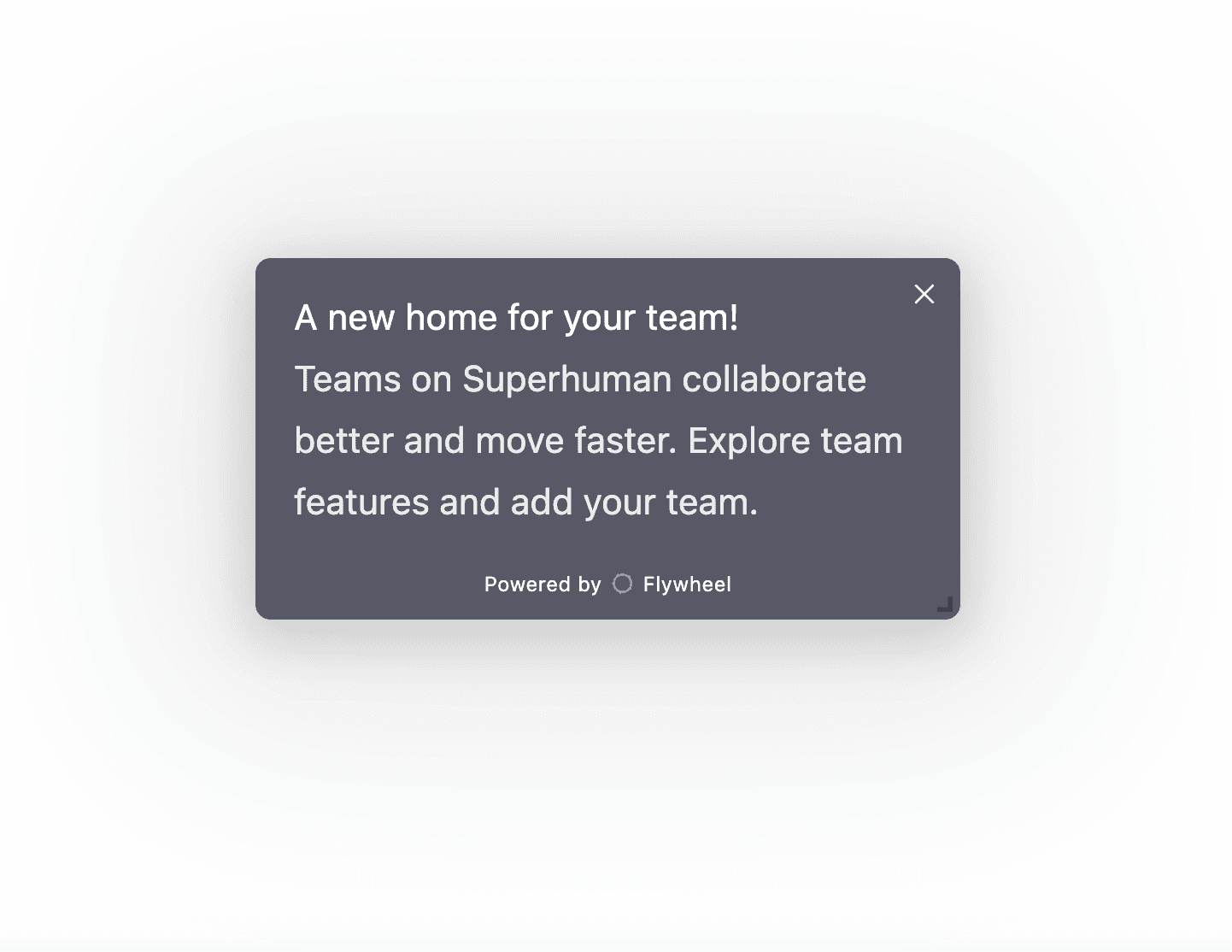
Floating Modal
This engagement template is available for every Flywheel user to modify and update to their brand language and purposes. It has been created using Flywheel's Engagements editor experience. Learn more about Engagements.
Superhuman calls themselves the fastest email experience — and clearly took notes from Linear. You'll find our Linear feature launch template looks remarkably similar. Both sit in the lower corner of your screen, have slightly different font colors for the title / content, and try to avoid annoying users.
As with our Linear analysis, we think Superhuman does a great job with the newest style of feature announcements. Instead of plastering a modal in the middle of the screen, they increase the chance that users will actually read the update before dismissing. They also link to an explanation of the feature rather than changing the user's page.
All-in-all, you can tell that both Superhuman and Linear are trying to tell users about improvements without getting in their way. And we applaud it.


