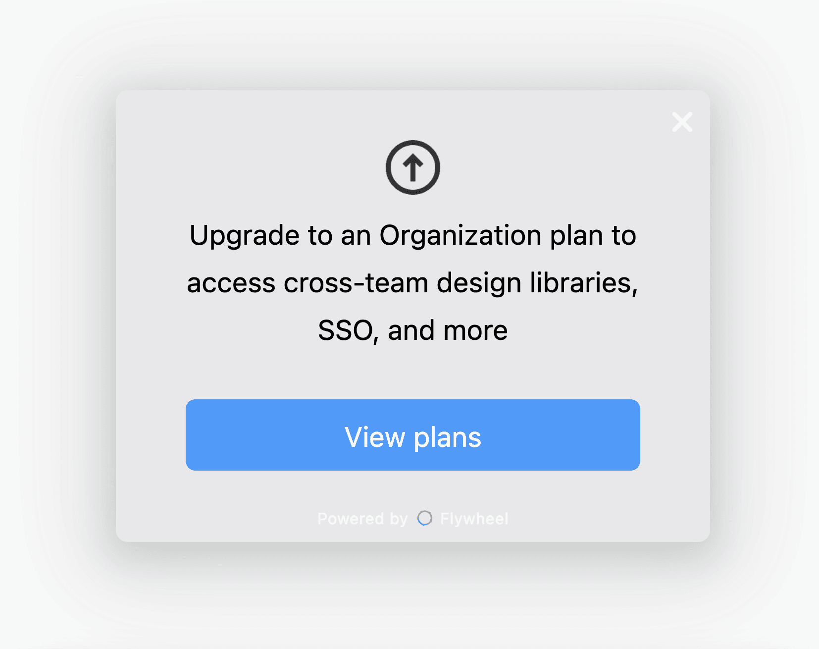
Anchored Modal
This engagement template is available for every Flywheel user to modify and update to their brand language and purposes. It has been created using Flywheel's Engagements editor experience. Learn more about Engagements.
This upgrade modal from Figma is an elegant upgrade experience for a few reasons. First, the icon clearly shows users what it's prompting them to do without needing a wall of text. Second, the CTA is to View Plans instead of directly upgrade.
While most companies try to drive users directly to entering their credit card, Figma as a per-seat pricing company focuses more on making sure users understand what their new bill will be. They supplement this practice by sending out alert emails before monthly payments. Few companies have the confidence to use this practice and instead hope slipping customers will forget to cancel.
Finally, this upgrade modal focuses on the value of upgrading. They keep it succinct and focus on key value-adds instead of highlighting all the benefits. For companies with larger organizations, SSO is a classic feature for enterprise upgrade purchases — and they know it.
Overall, this upgrade modal is as functional and unobtrusive as you'd expect from a company so focused on design. We think it's worthy of emulating and adding to your own software product.


